AERO SPINNING FITNESS
Identity | Styleguide | Apparel

This gym is a safe haven for gym-goers of all types to transform their habits in order to be the healthiest versions of themselves. It doesn’t matter if you’re into crossfit, cardio, or strength training. All you need is will power to find your point of singularity.

The typographic treatment within the logo echoes the extreme warping of matter and space from a black hole, referencing the modification of gym-goers' habits, while the logo’s silhouette reflects the primary audience. The color palette reflects sequential intensity, which is parallel to the tension and resolution of a workout with white being the point of rest, and red being the point of highest intensity. The silhouette represents Aero’s female primary audience, which has set the gym’s foundation. Even the the silhouette represents the females, the gym is inclusive of all genders.
The identity’s versatile nature allows the lockup to exist in modularity, creating variety for how this language exists on workout apparel. Each part of the logo is able to be taken apart and emphasized, working in modularity.

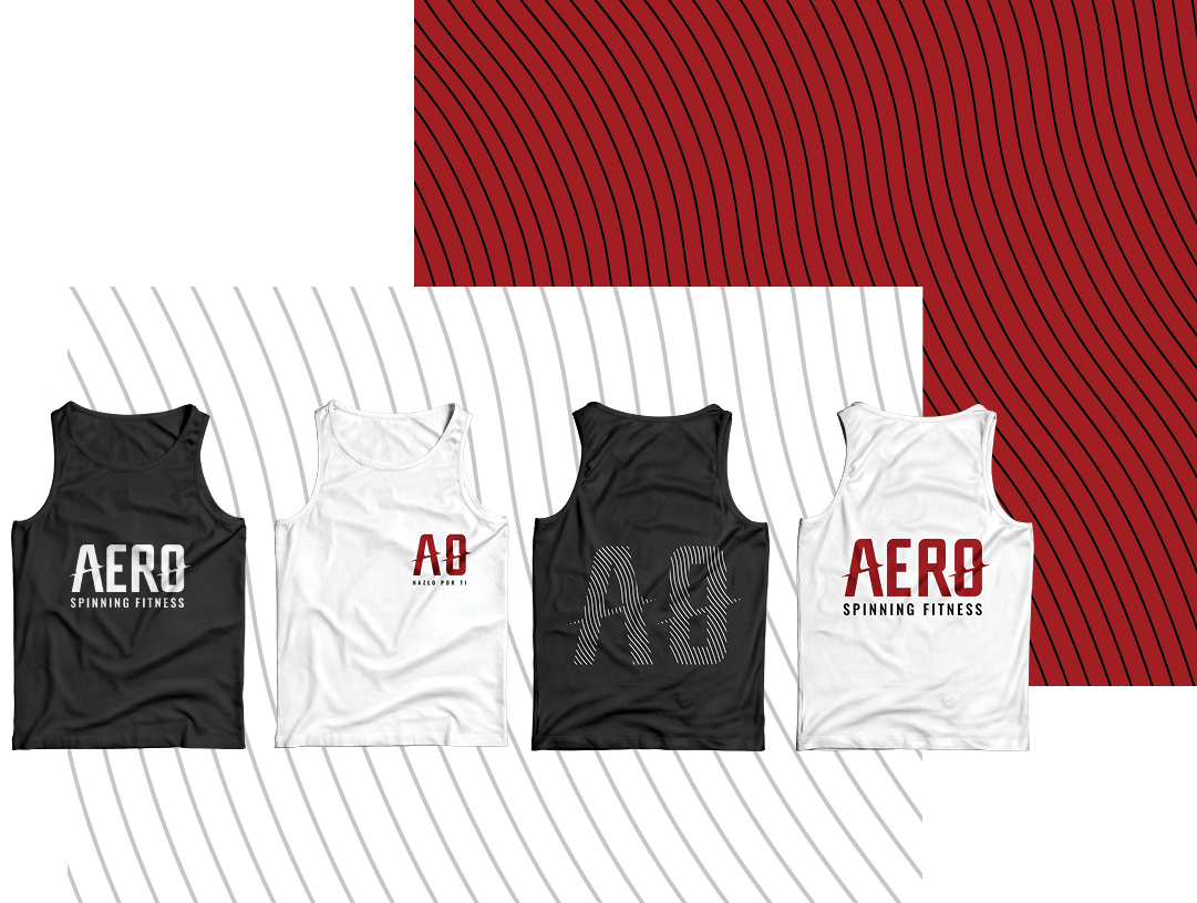

Aero Spinning Fitness’ brand tagline “Hazlo por Ti“ meaning “Do It for You“, symbolizing how fitness is a personal choice rather than a popularity contest. As long you’re diving into fitness with the goal of becoming your best self, that’s all that matters.


-

Primary Lockup
-

Secondary Lockup
-

Tertiary Lockup
-

Quaternary lockup


The typographic treatment of the A and the O within the lockup echoes an accretion disk from a black hole. The point of singularity is so massive, that its gravitational strength modifies time, space, and every bit of matter surrounding it. This ethos is applied to the modifications made to one’s life when investing in strength, health, and wellness. The lined pattern nods to one’s fingerprint, which is akin to one’s identity and is used as a textural forces, accompanying the visual brand assets.


As a celebratory beginning, the logo was painted onto the gym's wall to kick off the brand with many proud lovers of wellness.