THE LISTENERS PROJECT
Identity | Styleguide | Website | Signage


Interviewers are able to check out the Interview Kit at the Walla Walla library. Inside is a recorder, instructions on recording, interview etiquette, suggestion questions for kids and adults, and a reflection journal that allows for both parties to recollect on the interview in any artistic way they choose.
A MOMENT TO REFLECT
Interviewers and interviewees are prompted to provide reflection upon the interview. Reflection can take take place in many forms: poetry, illustration, photography, and more.

“Uncertainty. Fear. Communication. Responsibility.” 2021. Reflection Journal drawing of an interviewee by “Listener” Joel.
The lockup drew in inspiration from the work of Favianna Rodriguez, an artist who’s work is rooted in activism and social justice. The three elements that tie the lockup together anchor the brand in: the speech bubble, the sound waves, and the person. A secondary logo was designed to maintain the brand’s versatility, still containing the speech bubble.


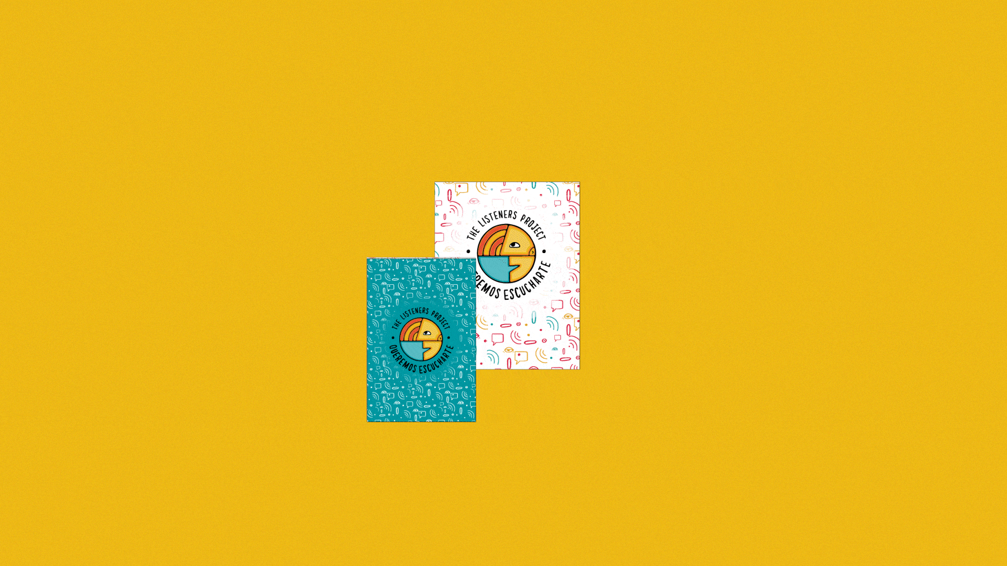
The brand’s signature pattern and icon set accompany the heart of the brand: listening, reciprocation, and being heard. The pattern and icons are stylized in an organic manner similar to the logo, bringing the tactile nature of connection and communication to the forefront. Sharing your story is a vulnerable experience, and it’s important for the brand to support.

Once an interview is completed, the Listeners return the kit to the Walla Walla public library where the recorded interview will be uploaded to the library’s database and be available to all who’d like to listen. This effort is put in place in order to instill harmony into the community of Walla Walla.


To get the word out, we built a website that contains information on what The Listeners Project is, where to check out the interview kit, why the interviews are important, the process that’s involved, the roster of Listeners, and upcoming events. A set of typographic treatments were made to headline each page of the website in a way that continues the heart of the brand’s narrative. Accessibility was practiced through manually implementing english and spanish versions of the website, proper color contrast, alt text, and proper typographic sizing.


